smartcreativz.com

Tuesday 3 May 2016

Creative Process 5: Speed painting video with Photoshop


Welcome to my latest Speed Painting Video

Step 1: 
Start with a line drawing and basic geometry


Step 2: 
Initial colour pass


Step 3: 
Build up colours and values


Step 4: 
Refine colour values to develope the mood


Step 5:
 Further refinement to create a cohesive image

Click below to view full video:

Sunday 24 January 2016

Wonder Woman: Creative process 4


 CREATIVE PROCESS 5: Wonder Woman Digital painting
http://www.smartcreativz.com/

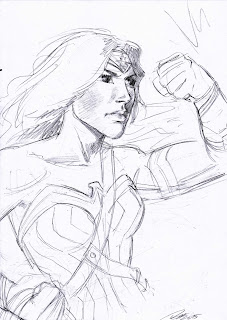
STEP 1: Line drawing
This is the sketch I decided to go with for this image. I wanted her full upper torso displayed so I could get the likeness of the actress playing the character in the upcoming film.

STEP 2: Colour pass
I spent some time getting the colours and shadows right, so even at this stage the image starts to take shape.

STEP 3: Refine values and tighten image
I drew a lot of inspiration from the pictures of the new film, while the colours aren't vibrant, they are vivid, and because of the primary light source I was able to add contrasting flesh tones to the highlighted and shadowed areas.

Thanks for viewing my blog tutorial. If you have any questions about my process that I didn't cover then drop me a message, and don't forget to check out more of my artwork at:

Saturday 14 March 2015

Aquaman: Creative process 4


 CREATIVE PROCESS 4: Aquaman Digital painting


STEP 1: Line drawing

After some early sketches to solidify the initial idea, I create the line drawing that will act as the bones of the image, making sure that the composition is solid.

STEP 2: Colour pass

I do a quick rough colour render to make sure the elements of the image hold up. I'm not too concerned with colouring the character at this point.

STEP 3: Refine background values

Because the image has a lot of draw distance I want to make sure the values are right giving the image a feeling of depth. 

STEP 4: Colouring the character

Because Aquaman is the main character of this piece, I want to make sure he stands out the most which is why I work on him after rendering the background.


STEP 5: Icing on the cake

Now I can really get to work on Aquaman and make sure he's the standout element by adding tattoos, some fish swimming about and a few bubbles.

Thanks for viewing my blog tutorial. To check out more of my artwork visit:


Wednesday 7 January 2015

Steampunk Frankenstein


CREATIVE PROCESS #3 STEAMPUNK FRANKENSTEIN

STEP - 1
I start with a fairly detailed pencil drawing that I use as a composition guideline.

STEP - 2
I begin by painting in an entire wash over the image making sure to avoid details and focus on the composition and how it registers in colour. At this stage I can make changes or adjustments quickly before committing to refined details.

STEP - 3
As well as rendering a refined paintover, I've added some details at the bottom of the image e.g rats etc.


http://www.smartcreativz.com/characters/
STEP - 4
I add the final element to the image, electricity.

To view my personal portfolio, visit:
http://www.smartcreativz.com/

Thursday 20 November 2014

Creative Process 2: Town Painting


STEP 1
-BASIC FORM-

My first step is to decide on a composition I'm happy with. After skimming through some books for inspiration I find something I like and use it as a rough template for what I want to achieve. Then I begin to sketch the environment using lines only, no detail just the basic shape geometry.
TIP: When using photo reference, aim to create something original and try not to copy exactly. Instead focus on the lighting and value information in the photo to guide your painting process.


STEP 2
-GREYSCALE-
Next I introduce grey tones to the line sketch to establish the light dynamics of the piece. I'm still not focused on detail at this point but I know I want an area of direct sunlight cast across the top of the hill.


STEP 3
-DEEPER TONE-

Now I start to paint over the lines - still in grey tones - this creates a more solid render and enables me to add deeper tones to shaded areas and focus more on the tonal values.


STEP 4
-COLOUR PASS 1-

Now to add colour. With my reference material handy I paint over with a basic wash, keeping in mind to preserve the colour values for objects close and objects further away.


STEP 5
-COLOUR PASS 2-

This is where I study my reference material more closely to get accurate shadows and paint in the details on the statue and houses.

STEP 6
-POLISH-

Now that I have everything rendered, I finish painting the sky, add some horses to give scale and refine the highlights. I'm not in a hurry at this point and tend to take the most amount of time on the finishing touches

Thank you for all the kind comments on my last post and I welcome any comments and questions.

To view my personal portfolio, visit:
http://www.smartcreativz.com/

Till next time...keep sketching:) Pat

Tuesday 4 November 2014

Creative Process Village Painting

STEP 1
-BASIC FORM-

The first step is to block in the basic shapes that - from a distance - give the impression of an environment painted with values. I'd just finished watching a Harry Potter film and was inspired by the Daigon Alley scene. No detail is needed at this point, just broad suggestive strokes. Some variations in form were necessary until I found a composition that works.

STEP 2
-COMMIT-

Once I'm happy with the composition, I commit myself to an idea and start to flesh out aspects of the foreground and values, but remain aware that changes can always be made as I go along.
This also helps to crystallize the concept in my mind.

STEP 3
-FLESHING OUT-

With a better understanding of the image as it develops, I start to put some details in, such as defining textures for the buildings, whilst constantly being aware of the values and lighting present.

STEP 4
-POPULATE-

No environment painting is complete without a population to inhabit it, you can put as much or as little emphasis as you like into sketching figures but it is important in making your environment feel lived in and believable, and also adds scale comparisons. This works especially well for large sprawling environments.

STEP 5
-POLISH-

Now that I've solidified the concept of an 'old village', it wasn't complete without something to draw the eye into the distance. I sort of had an idea about this at the beginning but hadn't decided what I was going to do at that point. In the end I chose to go with a much larger concept than I'd originally planned, by expanding the village with lots of rooftops and a cloudy sky.

If you got to the end of this post, (or skimmed through it)  I'd like to thank you for reading through my creative process, and I welcome any comments or suggestions for future posts.

To view my personal portfolio, visit:
http://www.smartcreativz.com/

Till next time...keep sketching:) Pat